INFORMATION ARCHITECTURE
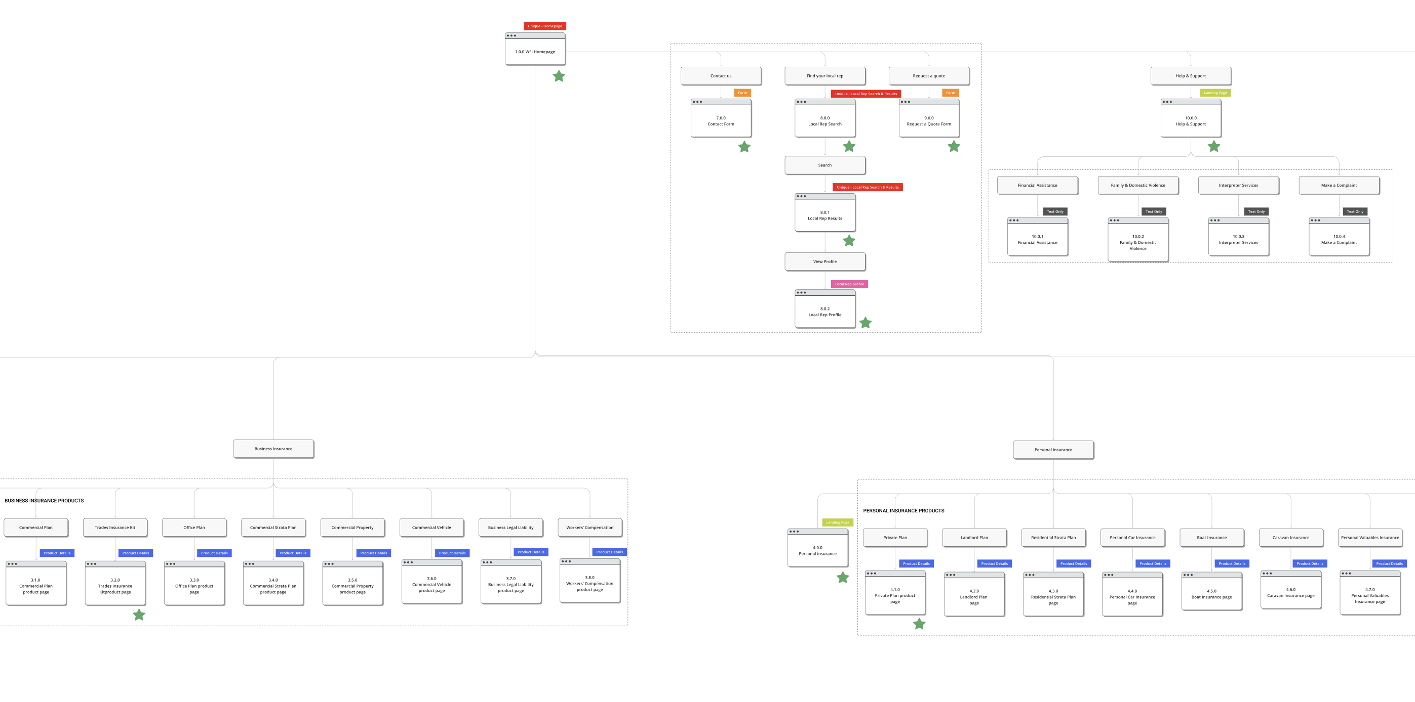
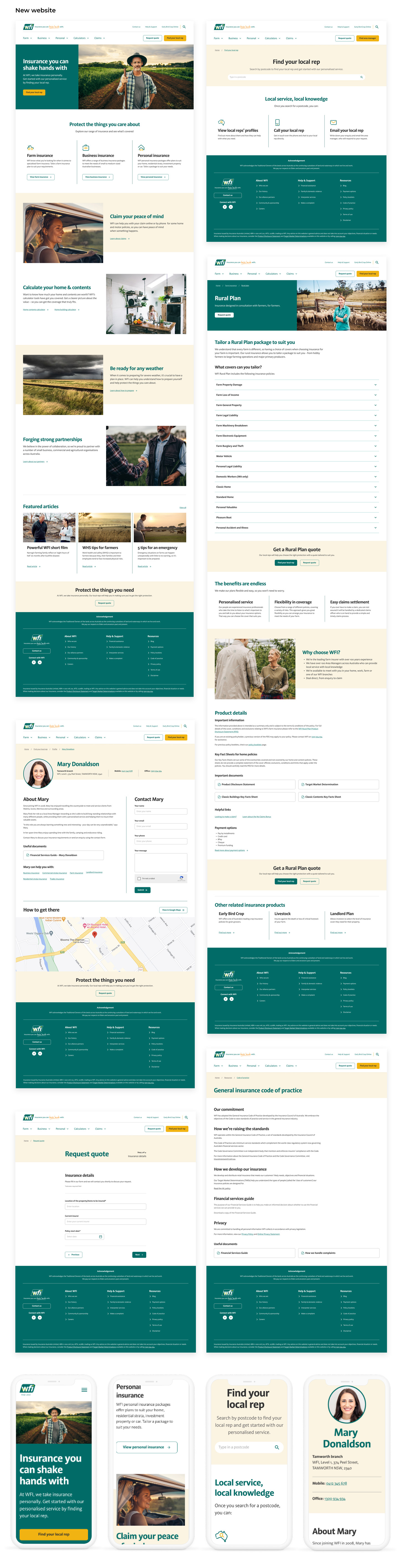
With a solid understanding of the user and business needs, as well as our solutions, I firstly looked at the website's current IA and looked to improve it with a more efficient and user-focused sitemap to make navigation easier and key actions more prominent.
I reviewed other comparative retail websites in insurance, as well as finance to also get a picture of best practice IA solutions.
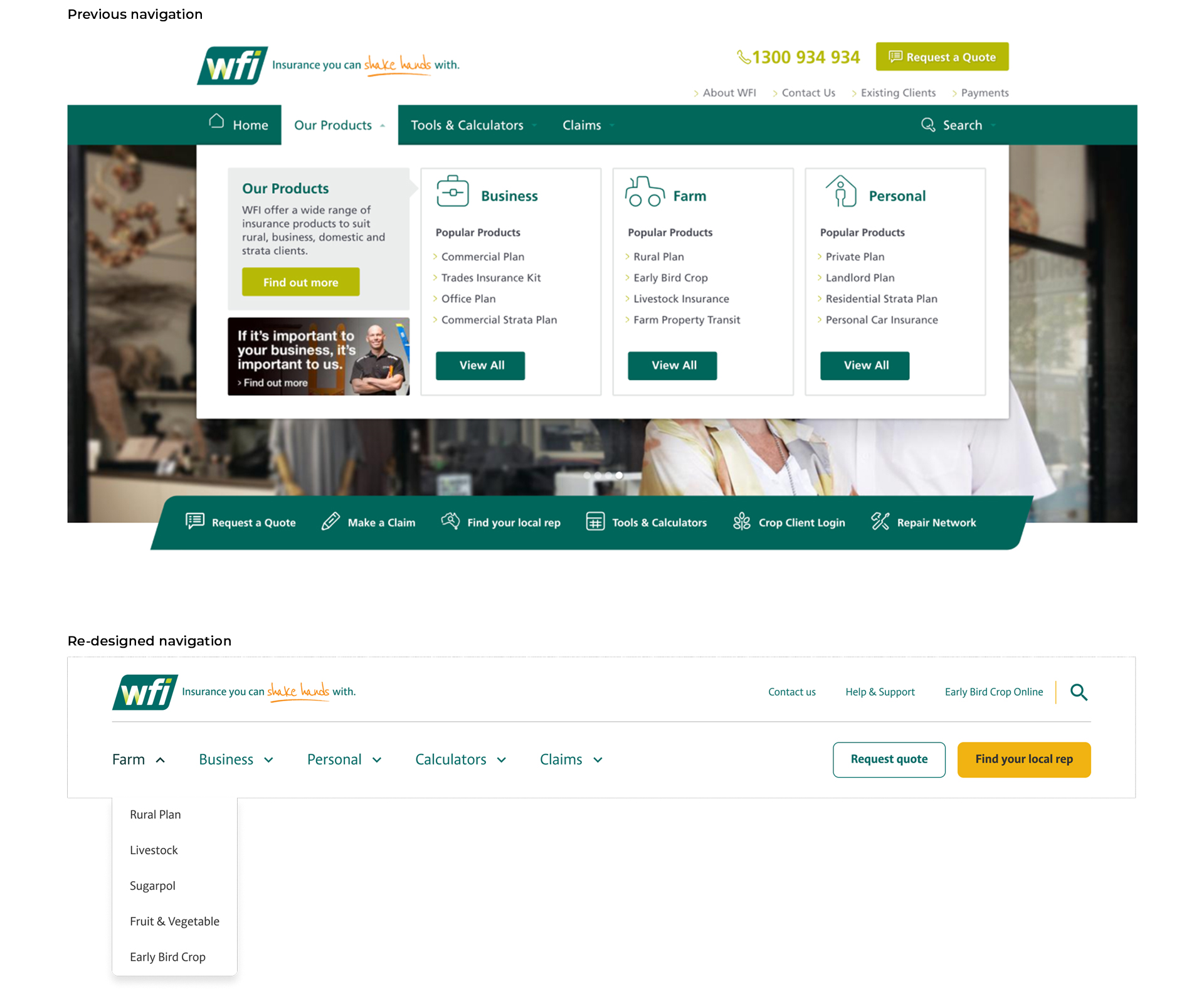
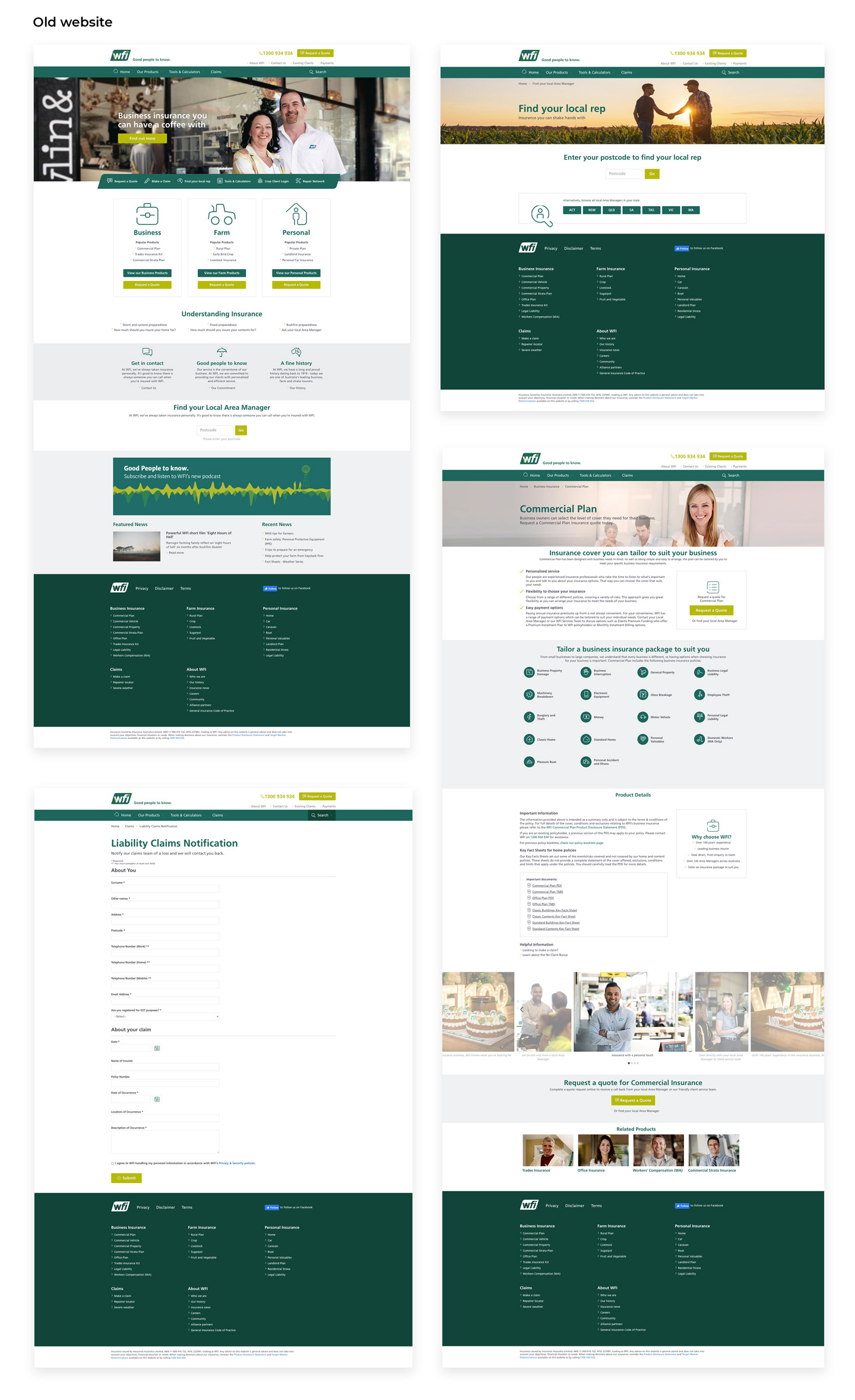
The existing website's navigation had unclear copy & labels, groupings & organisation that weren't logical to what a user would expect, repetitiveness and overwhelming info. My goal was to streamline the navigation, make the labels clearer, items better organised and make it easier & quicker for users to find what they were looking for.
I created two slightly different options and took the client through their pros and cons, before landing on a decision for the final refreshed sitemap, which was based on clearer labeling and less clicks to get to the most critical items.